What the Most Clicked Brands on the Wall Do Differently
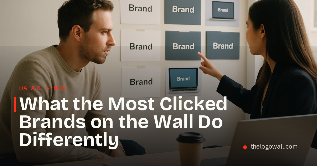
The brands that earn clicks usually make one thing easy to understand
The most clicked brands on a brand wall rarely win attention by trying to say everything at once. They usually do the opposite. Their names, visuals, and positioning make it easy for a visitor to understand what the company is, who it is for, and why it exists.
That matters because click data is a useful proxy for first-impression clarity. If a visitor pauses to open a profile, the brand has already done some of the work that many startups struggle with: it has earned enough curiosity to pull someone deeper.
For founders and marketers studying the most popular startups, the lesson is not to copy a style. It is to understand which signals consistently get noticed and which ones feel forgettable.
What click data tends to reward
Across a directory-style setting, the brands that attract more clicks usually share a few traits:
- They communicate a category quickly.
- They look distinct at thumbnail size.
- They feel current without being generic.
- They suggest momentum, usefulness, or relevance.
- They leave a small gap that invites a click for more detail.
That last point is often overlooked. A brand that explains itself too completely can reduce curiosity. A brand that is too vague can fail to earn interest. The strongest profiles sit in the middle: clear enough to understand, specific enough to remember, and open enough to explore.
For a deeper framework on why some brands outperform others once they appear on a page, see What the Best Performing Brands Have in Common.
The click pattern behind stronger brand pages
When a brand gets clicked more often, it is usually because the first impression does several jobs at once. The visual identity creates recognition. The positioning creates relevance. The profile makes the company feel worth a second look.
That is especially true for early-stage companies that do not yet have widespread market awareness. On a wall of logos, they are not competing on history. They are competing on perceived clarity and fit.
A useful way to think about it is this:
- The name should not slow the visitor down.
- The visual system should stand apart in a small space.
- The brand story should answer one practical question quickly.
- The overall presentation should feel intentional, not improvised.
Brands that meet those conditions are often the ones people click first, even if they do not yet have the biggest reputation.
What the most clicked brands do differently
They narrow the message
Brands that get attention tend to avoid broad, interchangeable language. They choose a sharper point of view, which helps the visitor understand what is different about them in a second or two.
For startup founders, that means the profile should not read like a mission statement written to impress everyone. It should read like an explanation a real buyer could repeat.
They use design as a sorting tool
On a busy page, design is not decoration. It is a filter. A distinctive palette, typography system, or logo shape can help a brand feel easier to notice and easier to remember.
The most clicked startups usually do not rely on complexity. They rely on recognition. One strong visual decision is often more effective than several small ones.
They match the expectation set by the brand name
Names that hint at a category, use case, or outcome often help because they reduce friction. When the name, visual identity, and product positioning align, the visitor does less decoding and more clicking.
That alignment does not need to be literal. It just needs to be coherent.
They feel credible without trying too hard
A page can look polished and still feel empty. The brands that earn more interest usually avoid that problem by giving off a sense of substance. That can come from a clean presentation, a focused message, or a design system that feels disciplined rather than decorative.
In practice, credibility is often built by restraint.
A simple takeaway for founders
The brands that attract clicks are usually not the ones shouting the loudest. They are the ones making the visitor’s decision easier.
For founders, the most useful question is not “How do we look impressive?” It is “What would make someone instantly understand us and want to learn more?”
That shift often improves naming, visual identity, and profile copy at the same time.
If the goal is to turn passive views into profile opens, it helps to design for fast comprehension, strong contrast, and one memorable idea.
How to apply this to a startup brand page
A founder reviewing a directory profile can start with three checks:
- Can someone understand the category in a single glance?
- Does the visual identity feel different from the surrounding logos?
- Is there one reason to click that feels concrete and believable?
If the answer to all three is yes, the brand is probably doing more than looking good. It is helping a visitor decide.
That is the real advantage behind many of the most popular startups on a brand wall. They are not merely visible. They are legible.
Founders can claim a permanent spot on The Logo Wall for $5.
Read next
 Logo Design Trends for 2026: What Startup Founders Should Watch
A practical look at logo design trends 2026, with clear guidance on what is staying relevant and what is starting to feel dated.
Logo Design Trends for 2026: What Startup Founders Should Watch
A practical look at logo design trends 2026, with clear guidance on what is staying relevant and what is starting to feel dated.
 What the Most Upvoted Brands Reveal About Startup Branding
An annual look at the brands that rise on the upvote leaderboard and what founders can learn from them.
What the Most Upvoted Brands Reveal About Startup Branding
An annual look at the brands that rise on the upvote leaderboard and what founders can learn from them.
 Which Startup Categories Are Growing Fastest?
A practical look at how to identify the fastest growing startup categories using first-party category counts and growth signals.
Which Startup Categories Are Growing Fastest?
A practical look at how to identify the fastest growing startup categories using first-party category counts and growth signals.