How to Design Minimalist Logos That Still Stand Out
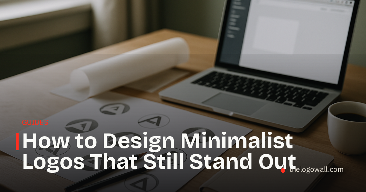
Why minimalist logos keep winning
Minimalist logos continue to appeal to startup founders because they are easier to recognise, easier to reproduce, and easier to extend across product surfaces. As brands move from dense websites to smaller interfaces, simplicity often creates more clarity, not less.
That does not mean every stripped-back logo works. The strongest minimalist logos usually remove decoration while keeping one memorable decision intact, such as an unusual shape, a precise proportion, or a distinctive letterform. The goal is not emptiness. The goal is control.
For a broader view on how people respond to brand presentation, it can help to compare this topic with What Makes Startup Logos Memorable and What the Most Upvoted Brands Reveal About Startup Branding.
What makes a minimalist logo work
A good minimalist logo usually succeeds on three levels.
- It is simple enough to be understood quickly.
- It has one recognisable detail that prevents it from becoming generic.
- It holds up in real-world use, from a browser tab to a pitch deck to packaging.
The best versions rely on geometry, spacing, and restraint rather than heavy effects. They often use a limited palette, but they still feel intentional. The logo should look inevitable, not unfinished.
Simplicity without sameness
One common mistake is assuming that less detail automatically creates stronger branding. In practice, minimalism can make a mark harder to distinguish if it removes too much character.
Founders should look for a balance between reduction and identity. If a logo can be swapped with a competitor’s mark without anyone noticing, it is probably too generic. A minimalist logo should still have a point of view.
How to judge minimalist logos before launch
Before a logo goes public, it helps to test it in the places where it will actually live.
- Check it at small sizes on mobile screens.
- Place it on light and dark backgrounds.
- Use it in a social avatar, a header, and a presentation slide.
- Compare it against competitors in the same category.
- Ask whether someone could sketch the logo from memory after one look.
This kind of review is less about taste and more about practical performance. A logo that looks elegant in isolation can still fail when reduced, cropped, or surrounded by other visual noise.
When less is the right strategy
Minimalism tends to work best when a brand needs to signal confidence, speed, or modernity. It is especially useful for digital products, infrastructure companies, and startups that expect the logo to appear in many constrained environments.
It can also help a young company avoid premature visual complexity. Early-stage brands often do not yet have the market recognition to support a highly detailed mark, so a simpler system can buy flexibility while the product and positioning mature.
At the same time, less is not always better. If the category is crowded with similar geometric marks, the brand may need a stronger accent in colour, typography, or motion to stay distinct.
Common mistakes to avoid
Minimalist logos fail most often for predictable reasons.
- They are reduced until they lose recognisability.
- They imitate current design trends too closely.
- They depend on subtle details that disappear at small sizes.
- They look polished but say nothing about the brand.
The strongest approach is to treat minimalism as a discipline, not a default. Every removed element should make the logo clearer, not merely more fashionable.
A simple framework for founders
A practical way to evaluate a minimalist logo is to ask four questions.
- Does it read clearly in one second?
- Does it have one distinctive feature?
- Does it work across digital and print uses?
- Does it feel connected to the company’s positioning?
If the answer to all four is yes, the logo probably has the right level of restraint. If not, the design may need more character, better spacing, or a stronger relationship to the brand story.
The takeaway
Minimalist logos work when simplicity is used to sharpen identity rather than erase it. The best marks are clean, adaptable, and easy to remember, but they still contain one detail that makes them feel owned.
For founders, the real test is not whether a logo looks minimal. It is whether it can stay minimal without becoming forgettable. If they want a simple place to keep building visibility, founders can claim a permanent spot on The Logo Wall for $5.
Read next
 How to spot rising startup brands before everyone else
A practical guide to identifying rising startup brands by looking past noise and focusing on signals founders and marketers can actually use.
How to spot rising startup brands before everyone else
A practical guide to identifying rising startup brands by looking past noise and focusing on signals founders and marketers can actually use.
 How startups can outbrand bigger competitors
A practical guide to how startups vs big brands can win attention through sharper positioning, clearer design, and faster brand decisions.
How startups can outbrand bigger competitors
A practical guide to how startups vs big brands can win attention through sharper positioning, clearer design, and faster brand decisions.
 DIY Logo vs Designer: an Honest Cost Breakdown
A practical breakdown of the real costs, trade-offs, and timing behind the diy logo vs designer decision for startups.
DIY Logo vs Designer: an Honest Cost Breakdown
A practical breakdown of the real costs, trade-offs, and timing behind the diy logo vs designer decision for startups.